>_Programming Partner
Loading technical insights...
Loading technical insights...
Software Developer
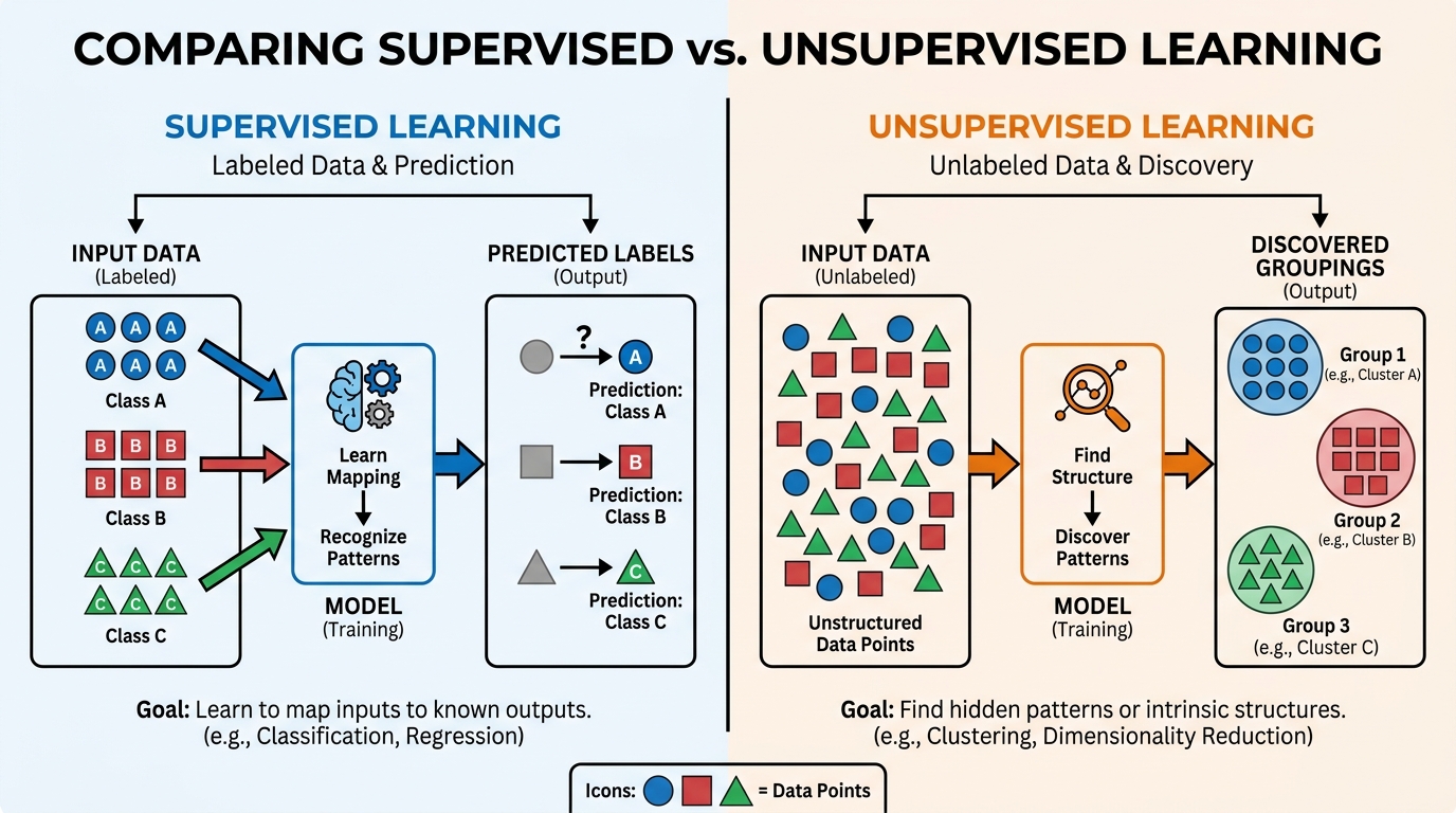
Unsupervised learning is a powerful approach in machine learning that helps us discover hidden patterns and structures within unlabeled data. Unlike supervised learning, where models learn from labeled examples, unsupervised methods work with raw data to find inherent groupings or relationships. This capability is crucial for making sense of vast datasets where manual labeling is impractical or impossible.
Clustering is a cornerstone of unsupervised learning, focusing on grouping similar data points together. It allows us to segment data into meaningful categories based on their intrinsic characteristics. In this comprehensive guide, we will explore the fundamentals of clustering using Python and the versatile Scikit-learn library.
You will learn about popular clustering algorithms like K-Means, Agglomerative, and DBSCAN. We will also cover essential techniques for evaluating your models and visualizing the results. By the end, you'll be equipped to apply these powerful tools to your own data exploration challenges.
Unsupervised learning is a branch of machine learning that deals with finding patterns in data without explicit guidance. Its primary goal is to uncover underlying structures, distributions, or relationships in datasets that lack predefined output labels. This means the algorithm works independently to find insights.
This contrasts sharply with supervised learning, where models are trained on data that includes both input features and corresponding output labels. For example, a supervised model might learn to classify emails as 'spam' or 'not spam' based on labeled examples. Unsupervised learning, however, would simply group similar emails together without knowing what 'spam' means.
The power of unsupervised learning lies in its ability to reveal previously unknown insights. It helps us understand the natural organization of data, making it invaluable for exploratory data analysis.
Clustering is not just an academic concept; it has profound practical importance across various industries. It helps businesses and researchers make data-driven decisions by identifying natural groupings within complex datasets. Understanding these groupings can lead to targeted strategies and improved efficiency.
Consider these real-world applications where clustering shines:
Customer Segmentation: Businesses use clustering to group customers with similar purchasing behaviors, demographics, or interests. This allows for highly targeted marketing campaigns and personalized product recommendations, leading to increased customer satisfaction and sales.
Anomaly Detection: In cybersecurity, clustering can identify unusual network traffic patterns that might indicate a cyberattack. Similarly, in manufacturing, it can detect defective products by grouping items that deviate from the norm. This helps in proactive identification of issues.
Document Categorization: Large collections of text documents, like news articles or research papers, can be automatically grouped by topic. This facilitates easier information retrieval and content organization, making it simpler to navigate vast amounts of text data.
Image Compression: Clustering can reduce the number of distinct colors in an image while maintaining visual quality. By grouping similar colors and representing them with a single centroid color, image file sizes can be significantly reduced. This is vital for efficient storage and transmission.
Genomic Analysis: Biologists use clustering to group genes with similar expression patterns, helping to identify genes involved in specific biological processes or diseases. This accelerates drug discovery and personalized medicine research.
The benefits of uncovering these natural groupings are immense. Clustering provides a powerful lens through which to view and interpret complex data, transforming raw information into actionable insights.
Before diving into the algorithms, let's ensure your Python environment is ready. We'll need a few essential libraries for data manipulation, machine learning, and visualization. These tools form the backbone of most data science projects in Python.
The core libraries we'll use are scikit-learn for the clustering algorithms, numpy for numerical operations, and pandas for data handling. For creating insightful visualizations, matplotlib and seaborn are indispensable. If you don't have them installed, you can easily add them using pip.
Open your terminal or command prompt and run the following command. This will install all the necessary packages, ensuring you have a smooth setup for the upcoming examples.
pip install scikit-learn numpy pandas matplotlib seabornOnce the installation is complete, you are ready to import these libraries into your Python scripts or Jupyter notebooks. This setup will allow you to follow along with all the code examples in this guide.
K-Means is arguably the most popular and widely used clustering algorithm. It's known for its simplicity and efficiency, making it a great starting point for many clustering tasks. The core idea behind K-Means is to partition a dataset into a predefined number of clusters, denoted by 'K'.
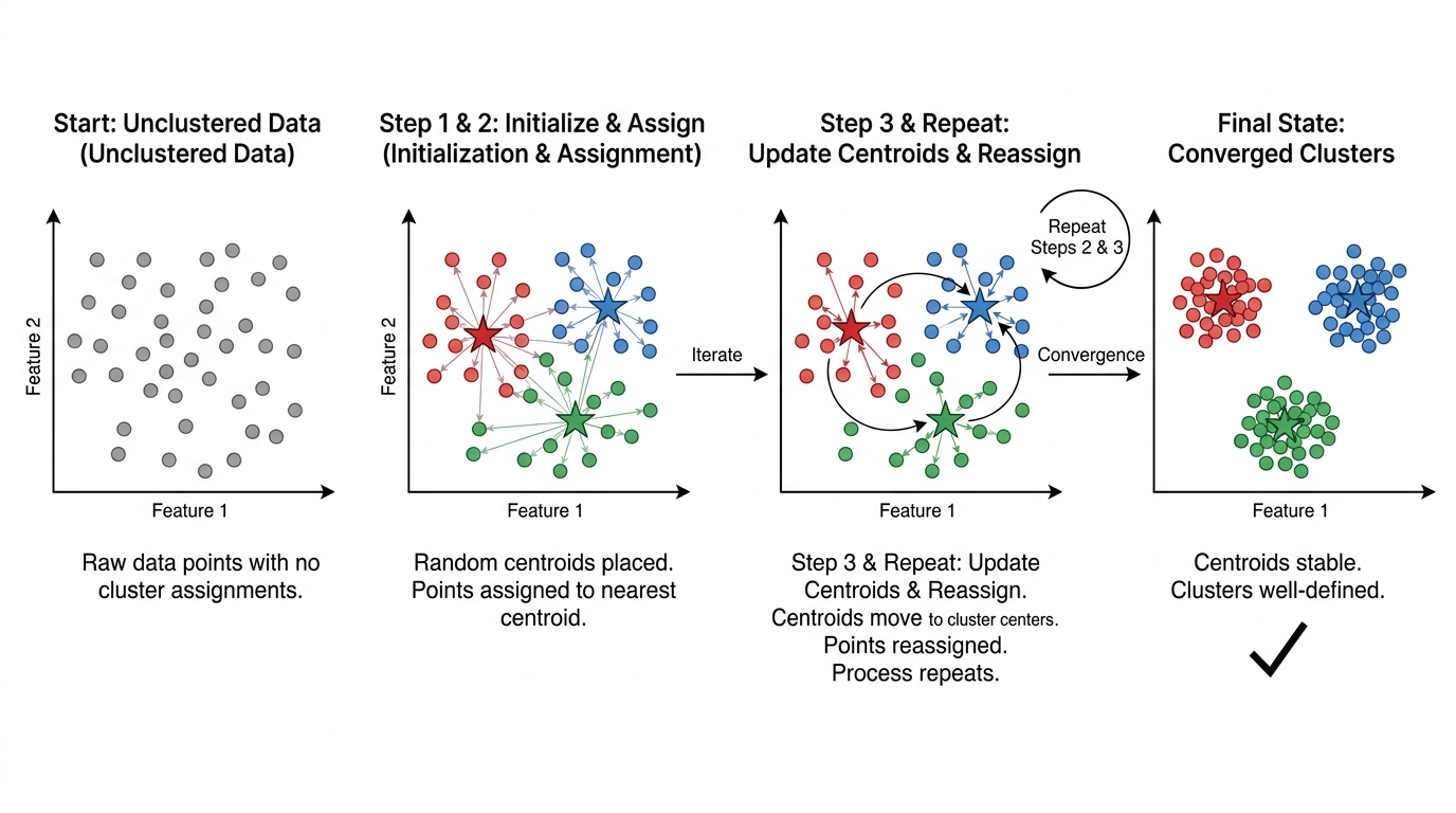
Each data point is assigned to the cluster whose centroid (mean) is closest to it. A centroid is simply the average position of all data points within a cluster. The algorithm iteratively adjusts these centroids and reassigns points until the clusters stabilize.
The goal of K-Means is to minimize the within-cluster sum of squares (WCSS), also known as inertia. This metric measures the sum of squared distances between each point and its assigned cluster centroid. A lower WCSS generally indicates better clustering.
The K-Means algorithm follows an iterative process to find the optimal cluster assignments. It starts with an initial guess and refines it step by step. Understanding these steps is key to grasping how K-Means operates.
Here's a breakdown of the K-Means iterative process:
These two steps (assignment and update) are repeated iteratively. The process continues until the cluster assignments no longer change, or a maximum number of iterations is reached. At this point, the algorithm has converged, and stable clusters are formed.
Scikit-learn makes implementing K-Means straightforward and efficient. We'll start by generating some synthetic 2D data using make_blobs to simulate distinct groups. This allows us to easily visualize the clustering results.
After generating the data, we'll initialize the KMeans model, fit it to our data, and then predict the cluster labels for each point. Finally, we'll visualize these clusters using matplotlib and seaborn to see how well the algorithm performed.
import numpy as np
import matplotlib.pyplot as plt
import seaborn as sns
from sklearn.datasets import make_blobs
from sklearn.cluster import KMeans

# Set a random seed for reproducibility
np.random.seed(42)

# 1. Generate synthetic 2D data
# We'll create 3 distinct 'blobs' or clusters
X, y_true = make_blobs(n_samples=300, centers=3, cluster_std=0.60, random_state=42)

# 2. Initialize the KMeans model
# We specify n_clusters=3, matching the true number of clusters
# n_init='auto' ensures a robust initialization by running the algorithm multiple times
kmeans = KMeans(n_clusters=3, random_state=42, n_init='auto')

# 3. Fit the model to the data
# The fit method performs the iterative clustering process
kmeans.fit(X)

# 4. Predict the cluster labels for each data point
# These are the cluster assignments determined by the algorithm
y_kmeans = kmeans.predict(X)

# 5. Get the cluster centroids
# These are the final mean positions of each cluster
centers = kmeans.cluster_centers_

# 6. Visualize the clustering results
plt.figure(figsize=(8, 6))
sns.scatterplot(x=X[:, 0], y=X[:, 1], hue=y_kmeans, palette='viridis', s=50, alpha=0.8)
plt.scatter(centers[:, 0], centers[:, 1], c='red', s=200, alpha=0.9, marker='X', label='Centroids')
plt.title('K-Means Clustering Results')
plt.xlabel('Feature 1')
plt.ylabel('Feature 2')
plt.legend()
plt.grid(True, linestyle='--', alpha=0.6)
plt.show()

print(f"Cluster centroids:\n{centers}")
In this code, make_blobs creates a dataset with three distinct groups, which we then feed into KMeans. The n_init='auto' parameter ensures that the algorithm runs multiple times with different centroid seeds and chooses the best result, preventing issues with poor initializations.
The scatter plot clearly shows the data points colored by their assigned cluster, with red 'X' marks indicating the final centroids. This visualization helps confirm that K-Means successfully identified the underlying structure in our synthetic data.
One of the biggest challenges with K-Means is choosing the right number of clusters, K. An incorrect K can lead to suboptimal or misleading results. Fortunately, there are quantitative methods to help guide this decision, such as the Elbow Method and the Silhouette Score.
The Elbow Method looks at the within-cluster sum of squares (WCSS) as K increases. WCSS generally decreases as K increases because points are closer to their own centroids. The 'elbow' point on the plot, where the rate of decrease sharply changes, suggests an optimal K. This point indicates that adding more clusters beyond this point provides diminishing returns in terms of reducing WCSS.
The Silhouette Score measures how similar a data point is to its own cluster compared to other clusters. It ranges from -1 to 1, where a high value indicates that the object is well-matched to its own cluster and poorly matched to neighboring clusters. A score near 0 indicates overlapping clusters, and negative values suggest that data points might be assigned to the wrong cluster. We aim for the highest Silhouette Score.
import numpy as np
import matplotlib.pyplot as plt
from sklearn.datasets import make_blobs
from sklearn.cluster import KMeans
from sklearn.metrics import silhouette_score

# Set a random seed for reproducibility
np.random.seed(42)

# Generate synthetic 2D data (same as before)
X, y_true = make_blobs(n_samples=300, centers=4, cluster_std=0.60, random_state=42)

# --- Elbow Method ---
wcss = [] # List to store Within-Cluster Sum of Squares
max_k = 10 # Test K values from 1 to max_k

for i in range(1, max_k + 1):
    # Initialize KMeans with different K values
    # n_init='auto' is important for robust results
    kmeans = KMeans(n_clusters=i, random_state=42, n_init='auto')
    kmeans.fit(X)
    # Append the inertia (WCSS) to the list
    wcss.append(kmeans.inertia_)

# Plot the Elbow Method graph
plt.figure(figsize=(10, 5))
plt.plot(range(1, max_k + 1), wcss, marker='o', linestyle='--')
plt.title('Elbow Method for Optimal K')
plt.xlabel('Number of Clusters (K)')
plt.ylabel('Within-Cluster Sum of Squares (WCSS)')
plt.xticks(range(1, max_k + 1))
plt.grid(True, linestyle='--', alpha=0.6)
plt.show()

# --- Silhouette Score ---
silhouette_scores = []
# Silhouette score requires at least 2 clusters, so start from K=2
for i in range(2, max_k + 1):
    kmeans = KMeans(n_clusters=i, random_state=42, n_init='auto')
    kmeans.fit(X)
    # Calculate silhouette score for the current K
    score = silhouette_score(X, kmeans.labels_)
    silhouette_scores.append(score)

# Plot the Silhouette Score graph
plt.figure(figsize=(10, 5))
plt.plot(range(2, max_k + 1), silhouette_scores, marker='o', linestyle='--')
plt.title('Silhouette Score for Optimal K')
plt.xlabel('Number of Clusters (K)')
plt.ylabel('Silhouette Score')
plt.xticks(range(2, max_k + 1))
plt.grid(True, linestyle='--', alpha=0.6)
plt.show()

# Print scores for reference
print("Elbow Method WCSS values:", wcss)
print("Silhouette Scores (for K=2 to K=10):", silhouette_scores)
In the Elbow Method plot, you'll look for the 'bend' or 'elbow' in the curve. For the Silhouette Score, you'll identify the K value that yields the highest score. Both methods provide valuable insights, and often, a combination of both is used to make an informed decision about the optimal K.
Agglomerative Hierarchical Clustering is a 'bottom-up' approach to grouping data points. Instead of starting with a fixed number of clusters, it begins by treating each data point as its own individual cluster. This creates a foundation where every point is initially isolated.
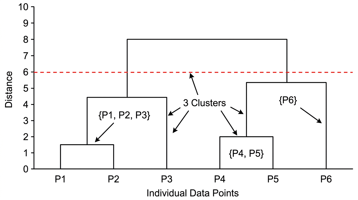
The algorithm then iteratively merges the closest pairs of clusters until only one large cluster remains, or a predefined number of clusters is reached. This process builds a hierarchy of clusters, which can be visualized as a tree-like structure called a dendrogram. This hierarchical structure offers a different perspective on data relationships compared to K-Means.
A key advantage of hierarchical clustering is that you don't need to specify the number of clusters beforehand. You can decide on the number of clusters by cutting the dendrogram at a certain level, allowing for more flexibility in exploring different granularities of clustering.
The merging process in agglomerative clustering relies on a 'linkage criterion.' This criterion determines how the distance between two clusters is calculated. Different linkage methods can lead to very different clustering results, so choosing the right one is important.
Common linkage criteria include:
Ward: Minimizes the variance of the clusters being merged. It tends to produce clusters of roughly equal size. This is often a good default choice.
Complete (Maximum) Linkage: Considers the maximum distance between any two points in the two clusters. It tends to produce compact, spherical clusters.
Average Linkage: Uses the average distance between all pairs of points in the two clusters. This method is a compromise between single and complete linkage.
Single (Minimum) Linkage: Measures the minimum distance between any two points in the two clusters. It can handle non-elliptical shapes but is sensitive to noise and outliers, often leading to 'chaining' where clusters merge along a path of single points.
A dendrogram is a tree diagram that visually represents the hierarchy of clusters. The x-axis shows the individual data points or clusters, and the y-axis represents the distance or dissimilarity at which clusters are merged. By drawing a horizontal line across the dendrogram, you can determine the number of clusters at that specific distance threshold.
Implementing Agglomerative Clustering in Scikit-learn is straightforward. We'll use AgglomerativeClustering from sklearn.cluster. This class allows us to specify the number of clusters and the linkage criterion.
To visualize the hierarchy, we'll leverage scipy.cluster.hierarchy to generate and plot a dendrogram. This provides a rich visual representation of how clusters are formed at different levels of similarity. We'll again use make_blobs for synthetic data.
import numpy as np
import matplotlib.pyplot as plt
import seaborn as sns
from sklearn.datasets import make_blobs
from sklearn.cluster import AgglomerativeClustering
from scipy.cluster.hierarchy import dendrogram, linkage

# Set a random seed for reproducibility
np.random.seed(42)

# 1. Generate synthetic 2D data
# We'll create 4 distinct 'blobs' for this example
X, y_true = make_blobs(n_samples=300, centers=4, cluster_std=0.7, random_state=42)

# 2. Perform Agglomerative Clustering
# We specify n_clusters=4 and use 'ward' linkage
agg_clustering = AgglomerativeClustering(n_clusters=4, linkage='ward')
agg_clustering.fit(X)

# Get the cluster labels
y_agg = agg_clustering.labels_

# 3. Visualize the clustering results
plt.figure(figsize=(8, 6))
sns.scatterplot(x=X[:, 0], y=X[:, 1], hue=y_agg, palette='viridis', s=50, alpha=0.8)
plt.title('Agglomerative Clustering Results (n_clusters=4)')
plt.xlabel('Feature 1')
plt.ylabel('Feature 2')
plt.grid(True, linestyle='--', alpha=0.6)
plt.show()

# 4. Generate and plot the dendrogram
# Compute the linkage matrix for the dendrogram
# 'ward' linkage is often used with Euclidean distance
Z = linkage(X, method='ward')

plt.figure(figsize=(12, 7))
plt.title('Hierarchical Clustering Dendrogram')
plt.xlabel('Sample Index or (Cluster Size)')
plt.ylabel('Distance')
dendrogram(
    Z,
    truncate_mode='lastp',  # Show only the last p merged clusters
    p=12,  # Show the last 12 merged clusters
    leaf_rotation=90.,
    leaf_font_size=8.,
    show_contracted=True,  # Show counts of points in merged clusters
)
plt.grid(True, linestyle='--', alpha=0.6)
plt.show()
The scatter plot shows the data points colored according to their assigned clusters by AgglomerativeClustering. The dendrogram provides a more detailed view of the merging process. You can visually inspect the dendrogram to decide on the optimal number of clusters by looking for large vertical drops, which indicate significant merges.
For instance, if you cut the dendrogram at a certain height, the number of vertical lines it intersects will tell you the number of clusters at that dissimilarity level. This flexibility is a key advantage when the optimal number of clusters isn't known beforehand.
DBSCAN, or Density-Based Spatial Clustering of Applications with Noise, offers a different approach to clustering. Unlike K-Means, it doesn't require you to specify the number of clusters beforehand. Instead, it identifies clusters based on the density of data points in a given region.
A significant advantage of DBSCAN is its ability to discover arbitrarily shaped clusters. This means it can find clusters that are not necessarily spherical or globular, which K-Means often struggles with. Furthermore, DBSCAN is excellent at identifying outliers or noise points, which are not assigned to any cluster.
This makes DBSCAN particularly useful for datasets with varying densities and the presence of noise. It's a robust choice when your data doesn't conform to the assumptions of centroid-based or hierarchical methods.
DBSCAN operates based on two crucial parameters: eps and min_samples. Understanding these parameters and how they define different types of points is fundamental to grasping DBSCAN's mechanics. These parameters control the density threshold for forming clusters.
eps (epsilon): This defines the maximum distance between two samples for one to be considered as in the neighborhood of the other. It essentially sets the radius of the neighborhood around each data point. A smaller eps means a denser cluster is required.
min_samples: This is the minimum number of samples (or data points) required in a neighborhood for a point to be considered a 'core point'. If a point has at least min_samples within its eps radius, it's a core point. This parameter dictates the minimum size of a dense region.
Based on these parameters, DBSCAN classifies each data point into one of three categories:
Core Point: A point that has at least min_samples (including itself) within its eps radius. These points form the dense parts of clusters.
Border Point: A point that has fewer than min_samples within its eps radius but is within the eps distance of a core point. Border points are on the edge of a cluster.
Noise Point (Outlier): A point that is neither a core point nor a border point. It has fewer than min_samples within its eps radius and is not reachable from any core point. These are considered outliers.
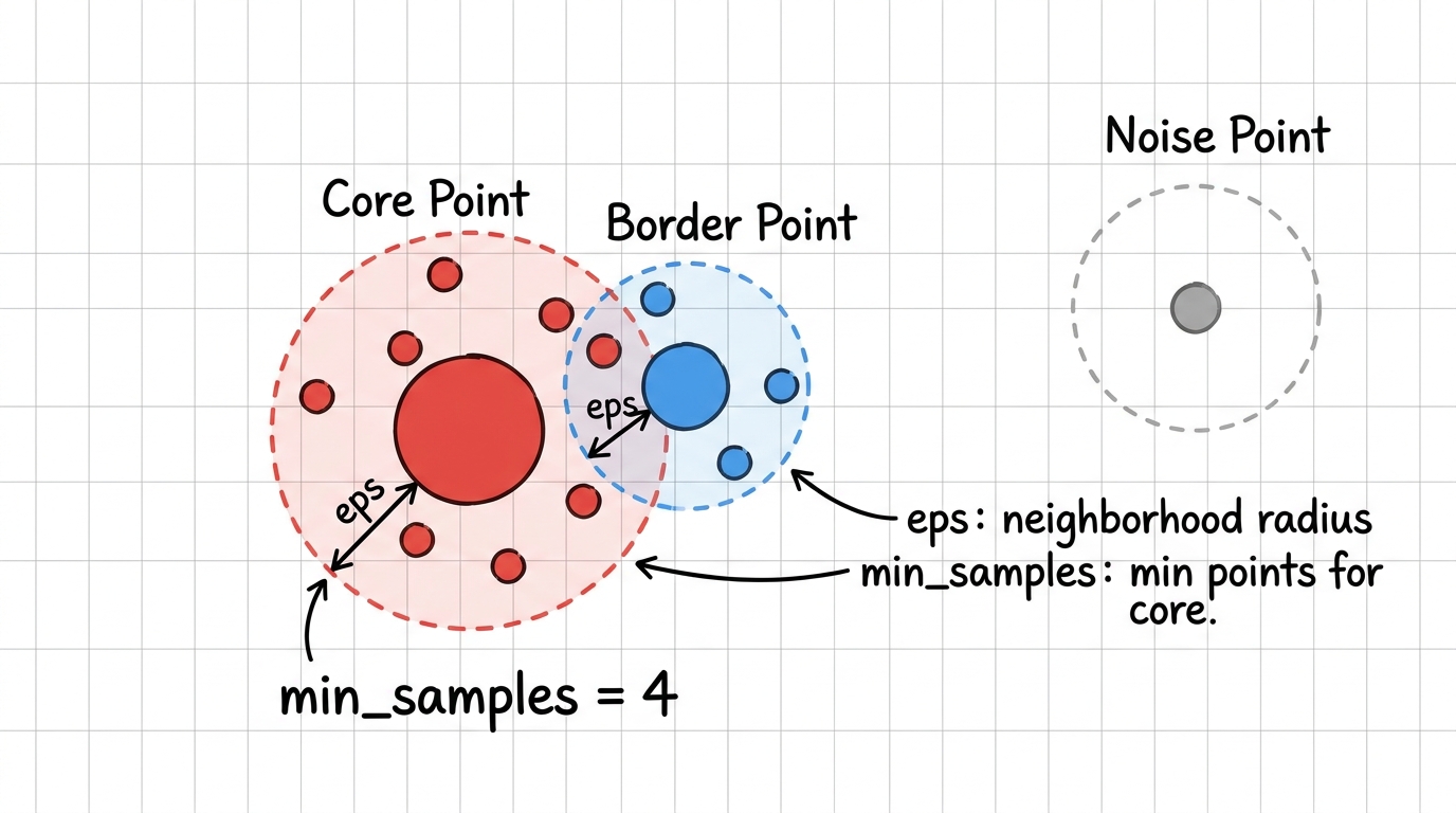
Scikit-learn's DBSCAN implementation is straightforward. We'll generate synthetic data that includes varying densities and some noise to showcase DBSCAN's strengths. This will allow us to see how it handles non-globular shapes and identifies outliers.
The key is to carefully tune the eps and min_samples parameters. These values are highly dependent on your dataset's density and scale. We'll then visualize the resulting clusters, paying special attention to the noise points, which DBSCAN labels as -1.
import numpy as np
import matplotlib.pyplot as plt
import seaborn as sns
from sklearn.datasets import make_moons, make_blobs
from sklearn.cluster import DBSCAN
from sklearn.preprocessing import StandardScaler

# Set a random seed for reproducibility
np.random.seed(42)

# 1. Generate synthetic data with varying densities and noise
# make_moons creates two interleaving half-circles, challenging for K-Means
X_moons, y_moons = make_moons(n_samples=200, noise=0.05, random_state=42)

# Add some additional noise points to the dataset
noise_points = np.random.rand(50, 2) * 2 - 1 # Random points between -1 and 1
X = np.vstack([X_moons, noise_points])

# 2. Scale the data
# DBSCAN is sensitive to feature scaling, so standardization is often crucial
scaler = StandardScaler()
X_scaled = scaler.fit_transform(X)

# 3. Initialize and apply DBSCAN
# Tune eps and min_samples based on data characteristics
# A common heuristic for min_samples is 2 * number_of_dimensions
dbscan = DBSCAN(eps=0.3, min_samples=5) # Example parameters
dbscan.fit(X_scaled)

# Get the cluster labels
# -1 indicates noise points
y_dbscan = dbscan.labels_

# 4. Visualize the clustering results
plt.figure(figsize=(10, 7))
sns.scatterplot(x=X_scaled[:, 0], y=X_scaled[:, 1], hue=y_dbscan, palette='viridis', s=50, alpha=0.8)
plt.title('DBSCAN Clustering Results (eps=0.3, min_samples=5)')
plt.xlabel('Scaled Feature 1')
plt.ylabel('Scaled Feature 2')
plt.grid(True, linestyle='--', alpha=0.6)
plt.show()

# Print the number of clusters found (excluding noise)
num_clusters = len(set(y_dbscan)) - (1 if -1 in y_dbscan else 0)
num_noise_points = list(y_dbscan).count(-1)
print(f"Number of clusters found: {num_clusters}")
print(f"Number of noise points: {num_noise_points}")
In this example, make_moons creates a dataset with crescent shapes, which K-Means would struggle to separate effectively. DBSCAN, however, successfully identifies these non-linear clusters and isolates the added noise points. The StandardScaler is used because DBSCAN is distance-based and sensitive to feature scales.
Experimenting with eps and min_samples is crucial for optimal results. A good starting point for min_samples is often twice the number of dimensions of your dataset. For eps, a common approach is to plot the k-distance graph (distance to the k-th nearest neighbor) and look for an 'elbow' point.
After running a clustering algorithm, it's tempting to rely solely on visual inspection of scatter plots to judge the quality of your clusters. While visualization is incredibly helpful for initial understanding, it's often insufficient for robust evaluation. Visual assessment can be subjective and misleading, especially with higher-dimensional data.
To truly assess the effectiveness of your clustering model, you need quantitative metrics. These metrics provide objective scores that allow you to compare different algorithms, parameter settings, or preprocessing techniques. They help confirm if the discovered patterns are statistically significant and meaningful.
Clustering evaluation metrics fall into two main categories: internal and external. The choice depends on whether you have access to ground truth labels for your data. Most real-world unsupervised problems lack ground truth, making internal metrics particularly important.
Internal evaluation metrics assess the quality of a clustering structure based solely on the data and the clusters themselves. They don't require any external information or ground truth labels. These metrics are invaluable in real-world scenarios where true labels are unavailable.
Two widely used internal metrics are the Silhouette Score and the Davies-Bouldin Index. We briefly touched upon the Silhouette Score when finding the optimal K for K-Means, but let's delve deeper into both.
Silhouette Score: As discussed, it measures how similar an object is to its own cluster compared to other clusters. A higher Silhouette Score (closer to 1) indicates well-separated and compact clusters. A score near 0 suggests overlapping clusters, and negative values imply data points might be in the wrong cluster.
Davies-Bouldin Index: This metric calculates the average similarity ratio of each cluster with its most similar cluster. Similarity is measured by the ratio of within-cluster distances to between-cluster distances. A lower Davies-Bouldin Index indicates better clustering, meaning clusters are compact and well-separated. The ideal value is 0.
import numpy as np
from sklearn.datasets import make_blobs
from sklearn.cluster import KMeans, AgglomerativeClustering, DBSCAN
from sklearn.metrics import silhouette_score, davies_bouldin_score
from sklearn.preprocessing import StandardScaler

# Set a random seed for reproducibility
np.random.seed(42)

# 1. Generate synthetic data for evaluation
X, y_true = make_blobs(n_samples=300, centers=4, cluster_std=0.7, random_state=42)

# Scale the data for DBSCAN and potentially other algorithms
scaler = StandardScaler()
X_scaled = scaler.fit_transform(X)

# --- K-Means Evaluation ---
kmeans = KMeans(n_clusters=4, random_state=42, n_init='auto')
kmeans.fit(X)
y_kmeans = kmeans.labels_

# Calculate Silhouette Score for K-Means
silhouette_kmeans = silhouette_score(X, y_kmeans)
# Calculate Davies-Bouldin Index for K-Means
davies_bouldin_kmeans = davies_bouldin_score(X, y_kmeans)

print(f"K-Means (K=4) Metrics:")
print(f"  Silhouette Score: {silhouette_kmeans:.3f}")
print(f"  Davies-Bouldin Index: {davies_bouldin_kmeans:.3f}")

# --- Agglomerative Clustering Evaluation ---
agg_clustering = AgglomerativeClustering(n_clusters=4, linkage='ward')
agg_clustering.fit(X)
y_agg = agg_clustering.labels_

# Calculate Silhouette Score for Agglomerative Clustering
silhouette_agg = silhouette_score(X, y_agg)
# Calculate Davies-Bouldin Index for Agglomerative Clustering
davies_bouldin_agg = davies_bouldin_score(X, y_agg)

print(f"\nAgglomerative Clustering (K=4, Ward) Metrics:")
print(f"  Silhouette Score: {silhouette_agg:.3f}")
print(f"  Davies-Bouldin Index: {davies_bouldin_agg:.3f}")

# --- DBSCAN Evaluation ---
# Note: DBSCAN can produce noise points (-1 label). Metrics handle this.
dbscan = DBSCAN(eps=0.5, min_samples=5)
dbscan.fit(X_scaled)
y_dbscan = dbscan.labels_

# Filter out noise points for metrics if desired, or let metrics handle them
# For silhouette_score, it's common to exclude noise points if they are significant
# For davies_bouldin_score, it requires at least 2 clusters and no noise points if only one cluster is found

# Check if there are at least 2 clusters (excluding noise) for metrics
if len(set(y_dbscan)) > 1 and -1 not in y_dbscan or (len(set(y_dbscan)) > 2 and -1 in y_dbscan):
    silhouette_dbscan = silhouette_score(X_scaled, y_dbscan)
    davies_bouldin_dbscan = davies_bouldin_score(X_scaled, y_dbscan)
    print(f"\nDBSCAN (eps=0.5, min_samples=5) Metrics:")
    print(f"  Silhouette Score: {silhouette_dbscan:.3f}")
    print(f"  Davies-Bouldin Index: {davies_bouldin_dbscan:.3f}")
else:
    print(f"\nDBSCAN (eps=0.5, min_samples=5) Metrics: Not enough clusters or too much noise for evaluation.")
These metrics provide a quantitative way to compare the performance of different clustering algorithms or parameter settings. Remember that a 'good' score often depends on the dataset and the problem context. It's always best to use these metrics in conjunction with domain knowledge and visualization.
External evaluation metrics are used when you have access to the 'ground truth' labels for your data. While true labels are rare in unsupervised learning problems, these metrics are invaluable for benchmarking algorithms on synthetic datasets or comparing against known classifications. They measure how well the clustering results match the predefined labels.
Key external metrics include the Adjusted Rand Index (ARI), Homogeneity, Completeness, and V-measure. Each offers a different perspective on the agreement between your clusters and the true labels. They help quantify the quality of your clustering in a supervised context.
Adjusted Rand Index (ARI): Measures the similarity between the true and predicted cluster assignments, adjusted for chance. A score of 1.0 indicates perfect matching, while 0.0 indicates random assignment. Homogeneity: Measures if each cluster contains only data points that are members of a single class. Completeness: Measures if all data points that are members of a given class are assigned to the same cluster. V-measure: The harmonic mean of homogeneity and completeness, providing a single score.
import numpy as np
from sklearn.datasets import make_blobs
from sklearn.cluster import KMeans
from sklearn.metrics import adjusted_rand_score, homogeneity_score, completeness_score, v_measure_score

# Set a random seed for reproducibility
np.random.seed(42)

# 1. Generate synthetic data with known ground truth labels
# We'll use 3 centers, so y_true will have labels 0, 1, 2
X, y_true = make_blobs(n_samples=300, centers=3, cluster_std=0.60, random_state=42)

# 2. Apply K-Means clustering (assuming we know K=3 for comparison)
kmeans = KMeans(n_clusters=3, random_state=42, n_init='auto')
kmeans.fit(X)
y_kmeans = kmeans.labels_

# 3. Calculate external evaluation metrics
ari = adjusted_rand_score(y_true, y_kmeans)
homogeneity = homogeneity_score(y_true, y_kmeans)
completeness = completeness_score(y_true, y_kmeans)
v_measure = v_measure_score(y_true, y_kmeans)

print(f"External Evaluation Metrics for K-Means (K=3) vs. Ground Truth:")
print(f"  Adjusted Rand Index (ARI): {ari:.3f}")
print(f"  Homogeneity: {homogeneity:.3f}")
print(f"  Completeness: {completeness:.3f}")
print(f"  V-measure: {v_measure:.3f}")
These external metrics are particularly useful when you're developing a new clustering algorithm or comparing existing ones. They provide a clear, objective measure of how well your algorithm recovers the true underlying structure of the data. High scores across these metrics indicate a strong agreement between your clusters and the known classes.
Visualizing clustering results is an indispensable step in understanding the patterns discovered by your algorithms. While quantitative metrics provide objective scores, visual inspection offers intuitive insights into cluster shapes, densities, and separations. It helps confirm if the clusters make sense in a human-interpretable way.
Effective visualization can reveal issues that metrics might miss, such as overlapping clusters, misclassified outliers, or clusters with unexpected shapes. It's a crucial bridge between raw data and actionable insights. For 2D or 3D data, scatter plots are the go-to method.
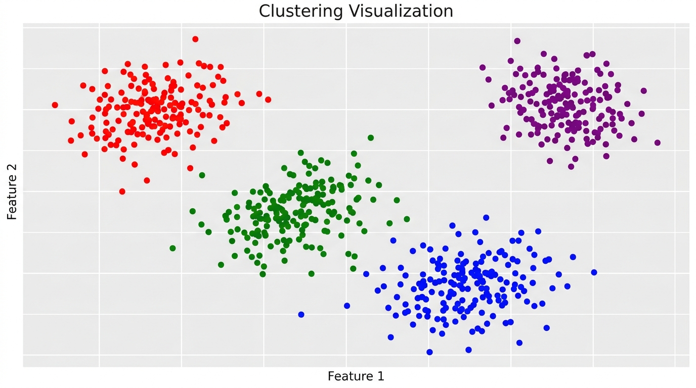
For datasets with two or three features, scatter plots are the most direct and effective way to visualize clusters. In a 2D scatter plot, each data point is plotted based on two features, and its color indicates its assigned cluster. This allows for immediate visual assessment of cluster separation and density.
When dealing with three features, a 3D scatter plot can be used to represent the clusters in a three-dimensional space. While 3D plots can sometimes be harder to interpret on a 2D screen, they offer a more complete view of the cluster structure in higher dimensions. Libraries like matplotlib and seaborn provide excellent tools for creating these visualizations.
import numpy as np
import matplotlib.pyplot as plt
import seaborn as sns
from sklearn.datasets import make_blobs
from sklearn.cluster import KMeans

# Set a random seed for reproducibility
np.random.seed(42)

# 1. Generate synthetic 2D data
X_2d, y_true_2d = make_blobs(n_samples=300, centers=4, cluster_std=0.7, random_state=42)

# Apply K-Means clustering
kmeans_2d = KMeans(n_clusters=4, random_state=42, n_init='auto')
kmeans_2d.fit(X_2d)
y_kmeans_2d = kmeans_2d.labels_

# 2. Visualize 2D clustering results
plt.figure(figsize=(8, 6))
sns.scatterplot(x=X_2d[:, 0], y=X_2d[:, 1], hue=y_kmeans_2d, palette='viridis', s=50, alpha=0.8)
plt.title('2D K-Means Clustering Visualization')
plt.xlabel('Feature 1')
plt.ylabel('Feature 2')
plt.grid(True, linestyle='--', alpha=0.6)
plt.show()

# 3. Generate synthetic 3D data
X_3d, y_true_3d = make_blobs(n_samples=300, centers=3, n_features=3, cluster_std=0.8, random_state=42)

# Apply K-Means clustering for 3D data
kmeans_3d = KMeans(n_clusters=3, random_state=42, n_init='auto')
kmeans_3d.fit(X_3d)
y_kmeans_3d = kmeans_3d.labels_

# 4. Visualize 3D clustering results
fig = plt.figure(figsize=(10, 8))
ax = fig.add_subplot(111, projection='3d')

# Use a colormap for consistent coloring across clusters
cmap = plt.cm.get_cmap('viridis', len(np.unique(y_kmeans_3d)))

for cluster_id in np.unique(y_kmeans_3d):
    ax.scatter(
        X_3d[y_kmeans_3d == cluster_id, 0],
        X_3d[y_kmeans_3d == cluster_id, 1],
        X_3d[y_kmeans_3d == cluster_id, 2],
        label=f'Cluster {cluster_id}',
        color=cmap(cluster_id),
        s=50,
        alpha=0.8
    )

ax.set_title('3D K-Means Clustering Visualization')
ax.set_xlabel('Feature 1')
ax.set_ylabel('Feature 2')
ax.set_zlabel('Feature 3')
ax.legend()
plt.grid(True, linestyle='--', alpha=0.6)
plt.show()
The 2D scatter plot provides a clear visual of the four distinct clusters identified by K-Means. For the 3D data, the plot allows us to rotate and inspect the clusters from different angles, revealing their spatial relationships. These visualizations are essential for gaining an intuitive understanding of your data's structure.
Most real-world datasets have more than three features, making direct visualization impossible. In such cases, dimensionality reduction techniques become invaluable. They transform high-dimensional data into a lower-dimensional space (typically 2D or 3D) while preserving as much of the original data's variance or structure as possible.
Principal Component Analysis (PCA) is a linear dimensionality reduction technique that finds orthogonal components (principal components) that capture the most variance in the data. It's often used for initial data exploration and noise reduction. t-Distributed Stochastic Neighbor Embedding (t-SNE) is a non-linear technique particularly good at preserving local structures, making it excellent for visualizing clusters that might be intertwined in high dimensions.
By reducing the dimensions, we can then apply our familiar 2D scatter plots to visualize clusters in complex datasets. This allows us to gain visual insights even when working with hundreds or thousands of features. It's a powerful combination of techniques.
import numpy as np
import matplotlib.pyplot as plt
import seaborn as sns
from sklearn.datasets import make_blobs
from sklearn.decomposition import PCA
from sklearn.manifold import TSNE
from sklearn.cluster import KMeans

# Set a random seed for reproducibility
np.random.seed(42)

# 1. Generate high-dimensional synthetic data
# Let's create data with 10 features (dimensions)
X_high_dim, y_true_high_dim = make_blobs(n_samples=500, centers=5, n_features=10, cluster_std=1.5, random_state=42)

# 2. Apply K-Means clustering to the high-dimensional data
kmeans_high_dim = KMeans(n_clusters=5, random_state=42, n_init='auto')
kmeans_high_dim.fit(X_high_dim)
y_kmeans_high_dim = kmeans_high_dim.labels_

# 3. Reduce dimensionality using PCA for visualization
# We'll reduce to 2 components for a 2D plot
pca = PCA(n_components=2, random_state=42)
X_pca = pca.fit_transform(X_high_dim)

# 4. Visualize clusters in the PCA-reduced space
plt.figure(figsize=(10, 7))
sns.scatterplot(x=X_pca[:, 0], y=X_pca[:, 1], hue=y_kmeans_high_dim, palette='viridis', s=50, alpha=0.8)
plt.title('K-Means Clusters Visualized with PCA (2 Components)')
plt.xlabel('Principal Component 1')
plt.ylabel('Principal Component 2')
plt.grid(True, linestyle='--', alpha=0.6)
plt.show()

# 5. Reduce dimensionality using t-SNE for visualization
# t-SNE is computationally more intensive, so it's often applied after PCA or on smaller datasets
# For larger datasets, consider reducing n_samples or using a faster variant like UMAP
tsne = TSNE(n_components=2, random_state=42, perplexity=30, n_iter=300)
X_tsne = tsne.fit_transform(X_high_dim)

# 6. Visualize clusters in the t-SNE-reduced space
plt.figure(figsize=(10, 7))
sns.scatterplot(x=X_tsne[:, 0], y=X_tsne[:, 1], hue=y_kmeans_high_dim, palette='viridis', s=50, alpha=0.8)
plt.title('K-Means Clusters Visualized with t-SNE (2 Components)')
plt.xlabel('t-SNE Component 1')
plt.ylabel('t-SNE Component 2')
plt.grid(True, linestyle='--', alpha=0.6)
plt.show()
The PCA plot shows the clusters projected onto the two principal components. While it captures overall variance, t-SNE often provides a more visually distinct separation of clusters, especially for complex, non-linear structures. This is because t-SNE focuses on preserving local neighborhoods.
When using t-SNE, parameters like perplexity and n_iter are crucial for good visualization. Perplexity can be thought of as a balance between focusing on local and global aspects of the data. Experimentation is often needed to find the best visualization.
With several powerful clustering algorithms at your disposal, deciding which one to use can be challenging. There's no single 'best' algorithm; the optimal choice depends heavily on the characteristics of your dataset and the specific goals of your analysis. A strategic approach is essential.
Understanding the strengths and weaknesses of each algorithm is the first step. You need to consider how each method handles different data distributions, noise, and scalability requirements. This knowledge will guide you toward the most appropriate tool for your problem.
This section will provide a comparative analysis of K-Means, Agglomerative, and DBSCAN. We'll also discuss the critical factors that should influence your decision-making process. This will empower you to make informed choices for your clustering projects.
Let's summarize the key characteristics of K-Means, Agglomerative Clustering, and DBSCAN in a comparison table. This will highlight their differences in terms of parameters, strengths, weaknesses, typical use cases, and underlying data assumptions. This overview helps in quick decision-making.
| Feature | K-Means | Agglomerative Clustering | DBSCAN |
|---|---|---|---|
| Parameters | Number of clusters (K) | Number of clusters (K) or distance threshold, Linkage criterion | Epsilon (eps), Minimum samples (min_samples) |
| Strengths | Fast, efficient for large datasets, simple to understand and implement, produces spherical clusters. | Hierarchical structure (dendrogram) provides insights into data relationships, no need to pre-specify K (can cut dendrogram), can handle various cluster shapes with different linkages. | Discovers arbitrarily shaped clusters, robust to noise and outliers, does not require specifying number of clusters beforehand. |
| Weaknesses | Requires pre-defining K, sensitive to initial centroid placement, struggles with non-globular clusters, sensitive to outliers, assumes equal cluster variance. | Computationally expensive for large datasets (O(n^3) or O(n^2)), sensitive to noise and outliers (especially single linkage), difficult to define optimal cut-off for dendrogram. | Sensitive to parameter tuning (eps, min_samples), struggles with varying density clusters, boundary points can be ambiguous. |
| Use Cases | Customer segmentation, image compression, document clustering (when K is known or estimated). | Phylogenetic trees, genomic analysis, hierarchical data exploration, when cluster hierarchy is important. | Anomaly detection, spatial data clustering, identifying clusters of varying shapes and densities, when noise handling is critical. |
| Data Assumptions | Clusters are spherical, roughly equal in size, and have similar densities. Data is numerical. | Clusters can be non-spherical depending on linkage. Data is numerical. Sensitive to distance metric. | Clusters are dense regions separated by sparser regions. Data is numerical. Assumes uniform density within a cluster. |
This table provides a quick reference for matching an algorithm to your data's characteristics. For instance, if you have noisy data with irregular cluster shapes, DBSCAN might be a better fit than K-Means. If you need to understand the relationships between clusters, Agglomerative clustering is ideal.
Beyond the algorithm's inherent properties, several practical factors should influence your choice. These considerations ensure that the chosen method is not only theoretically sound but also practically effective for your specific problem. Ignoring these can lead to suboptimal results.
Here are key factors to consider:
Data Shape and Distribution: Are your clusters expected to be spherical, or do you anticipate arbitrary shapes? K-Means excels with globular clusters, while DBSCAN handles irregular shapes better. Agglomerative can adapt depending on the linkage criterion.
Presence of Noise and Outliers: Is your dataset likely to contain many noisy data points or outliers? DBSCAN is explicitly designed to identify noise. K-Means and Agglomerative clustering are more sensitive to outliers, which can distort centroids or merge decisions.
Scalability with Large Datasets: How large is your dataset? K-Means is generally faster and more scalable for very large datasets due to its linear time complexity. Agglomerative clustering can become computationally prohibitive for millions of data points. DBSCAN's performance also depends on the density and indexing structures.
Interpretability of Results: How important is it to understand the hierarchy of clusters or the rationale behind cluster assignments? Agglomerative clustering provides a clear hierarchy via dendrograms. K-Means centroids are interpretable as average points. DBSCAN's density-based nature can be intuitive for spatial data.
Importance of Domain Knowledge: Do you have prior knowledge about the number of clusters or the expected cluster characteristics? This can guide your choice of K for K-Means or the parameters for DBSCAN. Domain expertise is invaluable for interpreting and validating the discovered clusters.
Successful clustering goes beyond simply running an algorithm. It involves a thoughtful process of data preparation, parameter tuning, and result interpretation. Adhering to best practices can significantly improve the quality and reliability of your clustering outcomes. These guidelines help ensure your analysis is robust.
Here are some practical tips for effective clustering:
Data preprocessing is arguably the most critical step in any machine learning pipeline, and clustering is no exception. The quality of your input data directly impacts the quality of your clusters. Neglecting this step can lead to misleading or meaningless results.
Feature Scaling: Most clustering algorithms, especially distance-based ones like K-Means, Agglomerative, and DBSCAN, are sensitive to the scale of your features. Features with larger ranges can disproportionately influence distance calculations. Standardization (e.g., StandardScaler) or normalization (e.g., MinMaxScaler) ensures all features contribute equally.
Feature Engineering: Creating new features or transforming existing ones can significantly enhance clustering quality. For example, combining two related features into a ratio or a difference might reveal underlying patterns that were not apparent in the raw features. Domain knowledge is crucial here to create meaningful features.
Outliers and noisy data points can significantly distort clustering results, especially for algorithms like K-Means that are sensitive to mean values. It's important to have a strategy for dealing with them. Different algorithms handle noise differently, so understanding these behaviors is key.
DBSCAN inherently identifies noise points, making it robust in their presence. For K-Means and Agglomerative clustering, you might consider preprocessing steps to remove or mitigate the impact of outliers. Techniques like robust scaling or outlier detection methods (e.g., Isolation Forest) can be applied before clustering. Alternatively, you might run clustering with and without outliers to assess their impact.
Clustering is rarely a one-shot process. It's an iterative journey of experimentation, evaluation, and refinement. You might try different algorithms, adjust parameters, or re-preprocess your data multiple times to achieve the most meaningful results. This iterative nature allows for continuous improvement.
Crucially, algorithmic results should always be combined with domain expertise. A high Silhouette Score doesn't automatically mean the clusters are meaningful in a real-world context. Domain experts can validate if the discovered groups align with business objectives or scientific hypotheses, providing invaluable context and ensuring the clusters are actionable.
While clustering is a powerful tool, it's also prone to common mistakes that can lead to flawed analyses or incorrect conclusions. Being aware of these pitfalls can help you navigate your clustering projects more effectively. Avoiding these errors ensures more reliable and insightful results.
Here are some common challenges and how to avoid them:
One of the biggest dangers is over-interpreting clusters without sufficient domain context or validation. Just because an algorithm finds clusters doesn't mean they are inherently meaningful or actionable. Always ask: 'What do these clusters represent in the real world?' and 'Are they distinct enough to be useful?'
Another pitfall is the 'curse of dimensionality.' In high-dimensional spaces, data points become sparse, and distances between points tend to become uniform. This can make it difficult for clustering algorithms to find meaningful groupings, as all points appear equally dissimilar. Dimensionality reduction techniques like PCA or t-SNE can help mitigate this, but be mindful of information loss.
Each clustering algorithm makes certain assumptions about the underlying structure of the data. For example, K-Means assumes clusters are spherical and of similar variance. Applying K-Means to data with arbitrarily shaped clusters will likely yield poor results. DBSCAN, on the other hand, assumes clusters are dense regions separated by sparser areas.
Blindly applying an algorithm without considering if its assumptions align with your dataset's characteristics is a common mistake. Always visualize your data (or its reduced dimensions) and understand its properties before selecting an algorithm. This ensures you choose a method that is well-suited to your data's inherent structure.
Clustering algorithms can have varying computational costs and memory requirements, especially when dealing with very large datasets. Agglomerative clustering, for instance, can be computationally expensive due to its O(n^2) or O(n^3) complexity, making it impractical for millions of data points. K-Means is generally more scalable but can still be slow for massive datasets.
For scalability challenges, consider alternative approaches. MiniBatchKMeans, a variant of K-Means, uses mini-batches of data to update centroids, significantly speeding up computation for large datasets. For hierarchical clustering, sampling or using approximate methods might be necessary. Always consider the computational resources available and the size of your data when choosing an algorithm.
Unsupervised learning, particularly clustering, is a fundamental and powerful tool for uncovering hidden insights in unlabeled data. We've journeyed through the core concepts, from the intuitive centroid-based K-Means to the hierarchical Agglomerative Clustering and the density-aware DBSCAN. Each algorithm offers unique strengths for different data characteristics.
You've learned how to implement these algorithms using Scikit-learn in Python, evaluate their performance with both internal and external metrics, and visualize the results to gain deeper understanding. We also discussed the strategic considerations for choosing the right algorithm and best practices to ensure robust and meaningful outcomes.
The ability to identify natural groupings in your data can unlock new perspectives, drive targeted strategies, and reveal previously unknown patterns. Now, armed with this knowledge and practical skills, you are well-equipped to apply these powerful clustering techniques to your own data exploration challenges and uncover valuable insights.
All code examples and files covered in this guide are available in the GitHub repository. Clone the project, experiment with the notebooks, and use the code as a reference while learning unsupervised machine learning.
GitHub Repository: Unsupervised Learning: Clustering in Python Using Scikit-learn
The 'curse of dimensionality' refers to various phenomena that arise when analyzing and organizing data in high-dimensional spaces. In clustering, as the number of features (dimensions) increases, the data points become increasingly sparse. This sparsity makes it difficult for distance-based algorithms to find meaningful clusters, as the concept of 'distance' becomes less intuitive and all points tend to be equidistant from each other. This can lead to clusters that are not well-separated or are simply artifacts of the high dimensionality.
Feature engineering is crucial for clustering because it transforms raw data into a format that better represents the underlying patterns. By creating new features or modifying existing ones, you can highlight relationships that were previously hidden, making it easier for clustering algorithms to identify distinct groups. For example, combining two related features into a ratio might reveal a cluster structure that wasn't apparent when looking at the features individually. Effective feature engineering can significantly improve the quality and interpretability of your clusters.
Yes, clustering is a powerful technique for anomaly detection. Anomalies or outliers are data points that do not conform to the expected pattern of other data points. In a clustering context, these are often points that either do not belong to any cluster (like noise points in DBSCAN) or belong to very small, isolated clusters. By identifying these unusual data points that deviate significantly from the main clusters, you can flag them as potential anomalies. This approach is widely used in fraud detection, network intrusion detection, and manufacturing defect analysis.
Beyond the foundational algorithms, several advanced clustering techniques address specific challenges. Gaussian Mixture Models (GMMs) assume data points are generated from a mixture of several Gaussian distributions, allowing for probabilistic cluster assignments. Spectral Clustering uses the eigenvalues of a similarity matrix to reduce dimensionality before clustering. Mean-Shift clustering is a non-parametric, density-based algorithm that does not require specifying the number of clusters beforehand and can find arbitrarily shaped clusters. These offer more flexibility for complex data distributions.
Clustering algorithms typically work best with numerical data, so categorical features require special handling. One common approach is one-hot encoding, which converts each category into a binary (0 or 1) numerical feature. For ordinal categorical data, you might assign numerical ranks. Alternatively, some distance metrics, like Gower distance, can directly handle mixed data types (numerical and categorical). For algorithms like K-Means, you might also consider K-Modes, a variant specifically designed for categorical data, or use embedding techniques to convert categories into dense numerical vectors.
Hard clustering assigns each data point to exactly one cluster, meaning a point either belongs to a cluster or it doesn't. K-Means, Agglomerative, and DBSCAN are examples of hard clustering algorithms. In contrast, soft clustering (or fuzzy clustering) assigns each data point a probability or a score of belonging to each cluster. This means a single data point can have a degree of membership in multiple clusters. Gaussian Mixture Models (GMMs) are a prime example of soft clustering, where each point is assigned a probability of belonging to each Gaussian component.
Build a powerful AI agent with Python and MCP, covering server setup, tool creation, agent connection, and dynamic tool calling for intelligent interactions
Unlock Random Forest mastery with our Python guide. Explore core concepts, implementation, hyperparameters, and real-world applications for robust ML
Master Decision Trees in ML, learning their mechanics, splitting criteria, Python implementation, and overfitting prevention for classification and regression